Buildn
Role
UX Designer
Timeline
July 2023 - March 2024
Tools
Figma
My Impact
As I was brought onto this project, I was taking over the previous UX Designer and building off of her work. Using her design system I ...
01
Led the development of responsive mobile design ensuring consistency across all screen sizes. Optimizing usability and accessibility for our
users regardless of what devices they use.
02
Created the contractor’s profile page to highlight their best projects and give the client an idea of who they’ll be working with.
03
Kicked off the next phase of the website development by designing the user experience for contractors to invoice clients directly from our platform.
Problem Space
In Canada, there is a market demand for contractors but only a small portion of them are online. In 2020, there were more than 1.7 million searches per month for contractors. However, many contractors avoid online marketing or don’t have a strong online presence.
How Might We...
With our web platform we’re marketing to two distinct groups, contractors and homeowners, for this we need to have two HMW statements to help guide our project.
Contractors
“How might we help existing construction workers and contractors market their services online effectively in order to generate more business?”
Homeowners
“How might we provide homeowners with easy access to reliable contractors in order to help them complete their dream projects?”
Design System
For my own design ideas to stay true to the brand, I followed the design system that Rina Lou, our previous designer. Using this system, I incorporated their styling into my designs and mobile resizing.


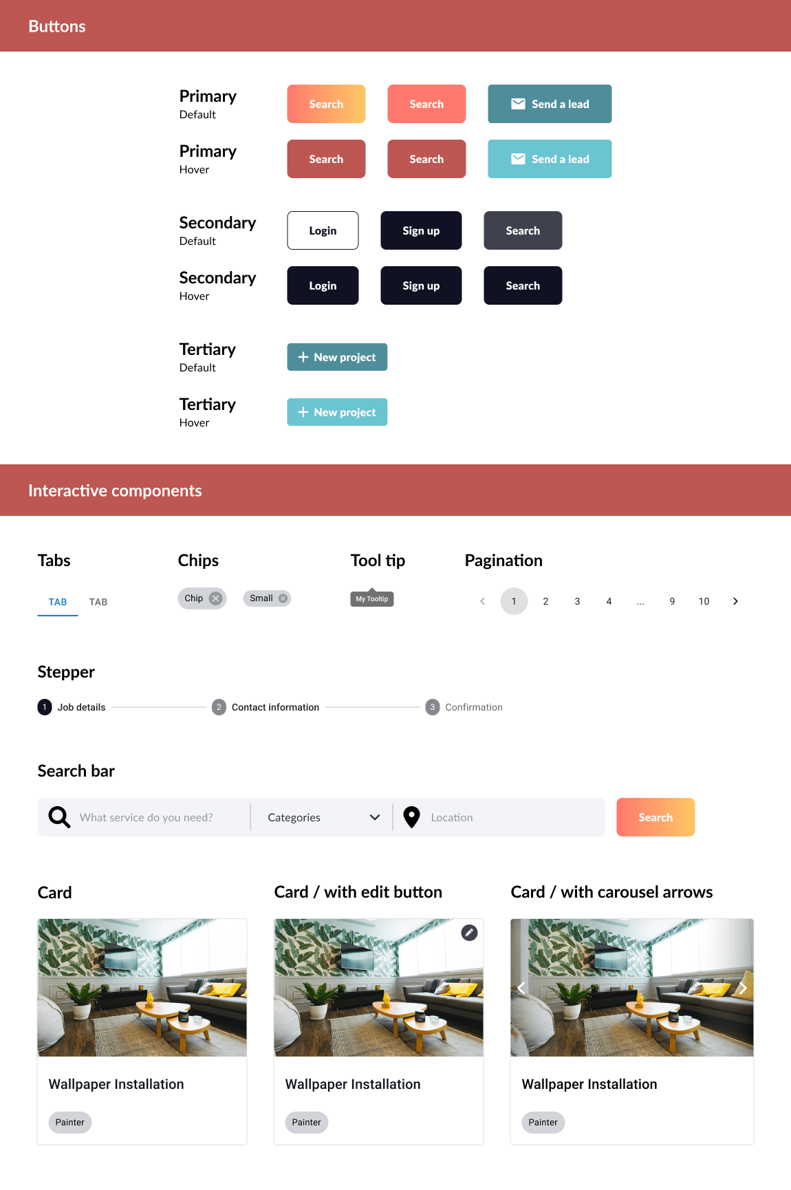
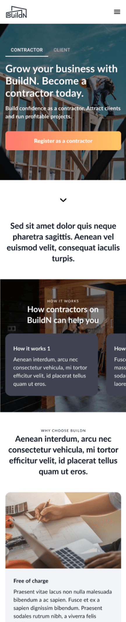
Responsive Design
My first task with the Buildn team was to convert their website into a responsive mobile design. This involved meticulously adjusting the layout, navigation and content to ensure our users have the same experience on a smaller screen. Our goal was to guarantee a seamless and consistent user experience across all devices and encourage engagement for our audience.
Resizing and Reorganizing
Here, I reorganized and resized the form field to fit a smaller phone screen. Decreasing text field size and ensuring the width extends to the sides of the container.


I paid close attention to the layout of pages containing numerous text fields, keeping in mind the spacing between each field to maintain user readability and avoid overwhelming our users with dense content.


Continuing Designs
The next big project I was given was to build out how the contractor would flow through our platform. From editing their profile page to sending out an
estimate to their customer. The first step I took was mapping out the flow, that way the user, the contractor, could navigate intuitively from one page to another.
Nav Bar
User clicks on profile icon
Profile Page
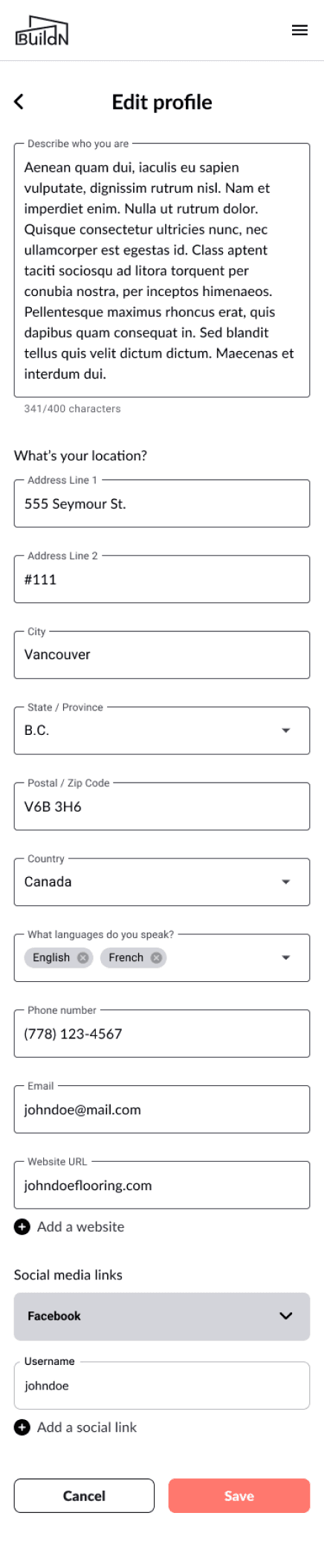
Edit Profile Page
User clicks on message icon
Leads Dashboard
Estimate Creation
Once I worked this flow with my web developers, I then moved to create the designs for our contractor’s profile and the pages for invoicing their clients.
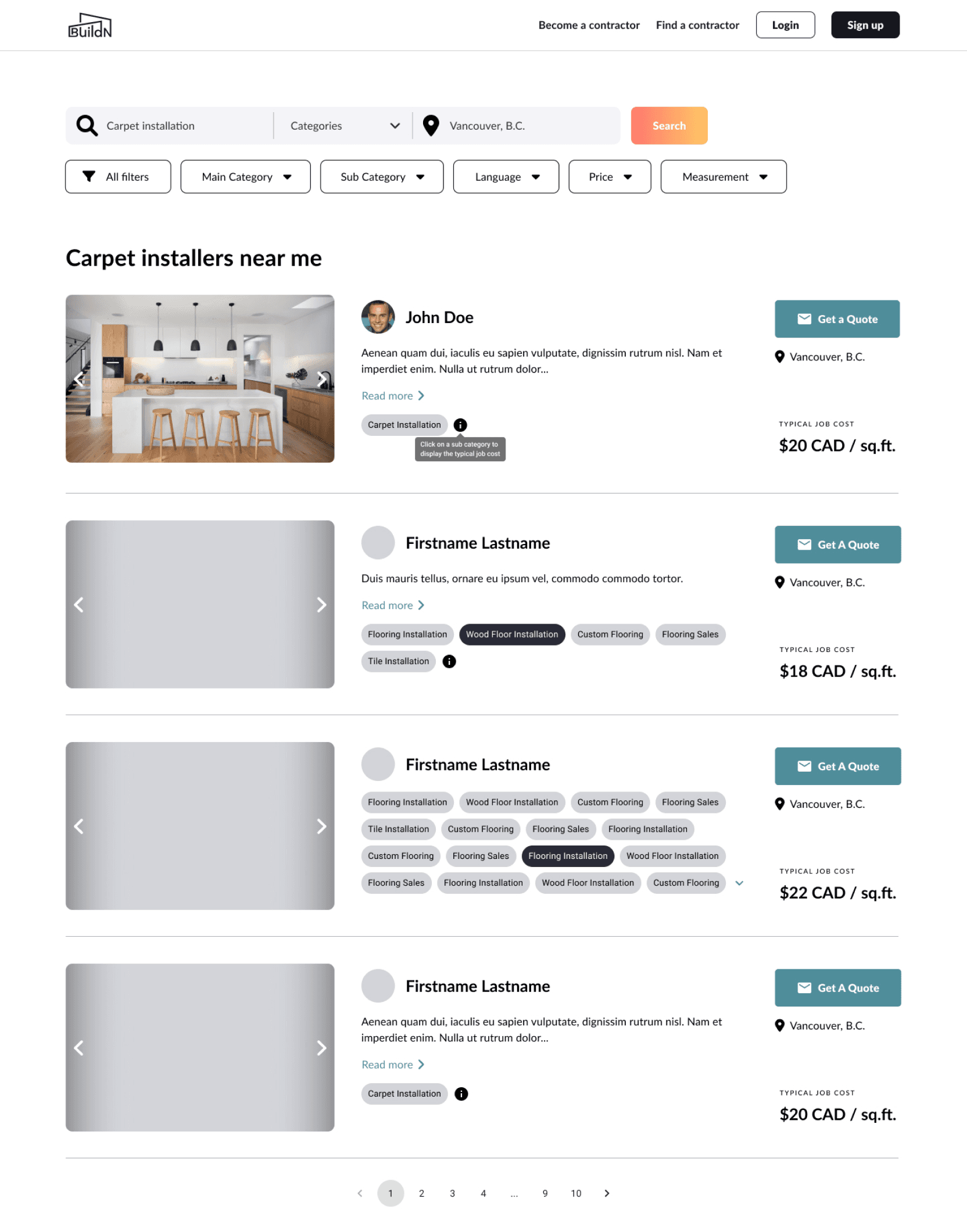
Profile Page
While creating this page, I kept in mind the type of user who is first joining our platform. Not all of our users would be as tech-savvy as others that’s why I included a checklist for the user to complete to fully build out their profile.

Here it was a pretty simple design, using the text fields and drop downs from our design system , I created a form that was easy for our user to follow through.

The next step of completing their profile page was adding content to their project section it was another form field, so it was fairly easy. The challenge after this was creating a design that could best showcase their work to convince clients to trust this contractor and hire them for work.

I took inspiration from various websites, such as Pinterest, Dribbble, and in particular Behance, I liked how they sectioned off their profile page, one area for the profile and the other for the work. The reason why I chose to use a similar layout was so that the user could see the beautiful work on one side and the details, and specifications on the other. That way the client wouldn’t need to scroll through this page all that much.

Estimate & Invoices Creation
For this design, I worked closely with my manager he had experience in working with contractors and understood what kind of information they needed to get a picture of the project they were going to tackle.
I’ve included the contact information, job description and a “Create an Estimate” CTA to convert this lead into an estimate and eventually, an invoice. On the side tab, the contractor can navigate to all his estimates and invoices he created and can manage from there.
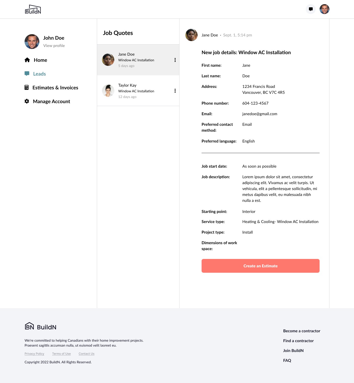
Here I created two sections, accepted estimates would be placed into “Jobs” and those that haven’t would be in “Pending Estimates”. I felt this would give the contractor an easier time to manage his work and to know which of his clients he would need to follow up with.

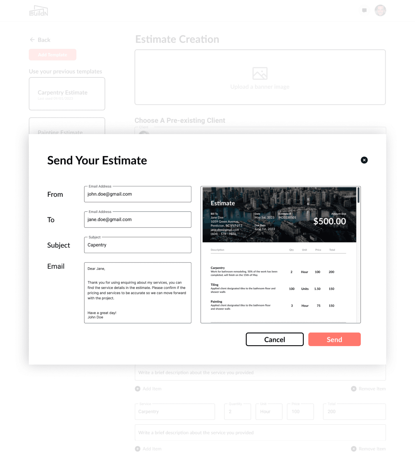
Here I used my background knowledge of the accounting software QuickBooks to create an “Estimate Creation” page. This page had the basics, line items, due date, and identification number. I also left an area for the contractor to upload a sort of banner to give their invoice a bit of style.

Once the contractor has entered everything they needed to, they can review it one last time, before sending it. I also gave the contractor a little window to view how their template would look like
Takeaway
From my time working through the mobile redesign, creating the estimate & invoicing process and crafting the profile page, I developed my skills in intuitive navigation and seamless flows. The challenge of prioritizing the user showed me the impact of the user's needs and preferences. How much they influence the layout and the user interface. As designs are never truly finished, there’s always room for improvement. The next step in this project would be conducting user testing to see how this design can hold up to real-life trials.
Next Project
CIBC Mobile Banking App -
Project
Performed a heuristic evaluation of CIBC’s mobile banking app, identified issues and opportunities for improvement. Redesigned their platform to enhance user experience.
Click Here