
Vitacore Industries Inc.
Role
UX Designer
Timeline
September 2023 - August 2024
Tools
Figma
Background
When I first joined Vitacore, there was a lack of a design system that my department would use. We would waste time sifting through old Figma files and referencing previous creations, which slowed our deliverables. With Vitacore's rapid growth, including the launch of a subsidiary company amid the pandemic, there was an urgent need for a structured approach to design. I volunteered to take responsibility for developing a design system that would improve and speed up our workflow. I worked closely with my Marketing Director and researched other existing design systems to create this project, a single source of truth that will help guide future designs.
The Research
To better understand the problem, I researched the common practices and principles of a successful design system. Drawing from my previous experience working in Buildn, their design system took cues from Google’s Material Design, this familiarity would help me build my own. Further research also led me to discover one system called Backstage by Spotify and rediscovered a design principle called Atomic Design. Both of these would help me incorporate a similar organizational principle into my own design. With these examples, I went on to create a comprehensive UX framework that would streamline our work.

Material Design


Building The Structure
To give my work a sense of professionalism and pride I wanted to do what other designers in big companies have done, give our systems a name. Our parent company Vitacore, mainly focused on R&D research, so I gave it the name labs to arch back to our history of science first. For our subsidiary company, Planet !mpact our focus was recycling and the well-being of the environment, for that I gave it the name Ecosystems. I wanted to inspire the idea that a design system was akin to a growing ecosystem.


Typography
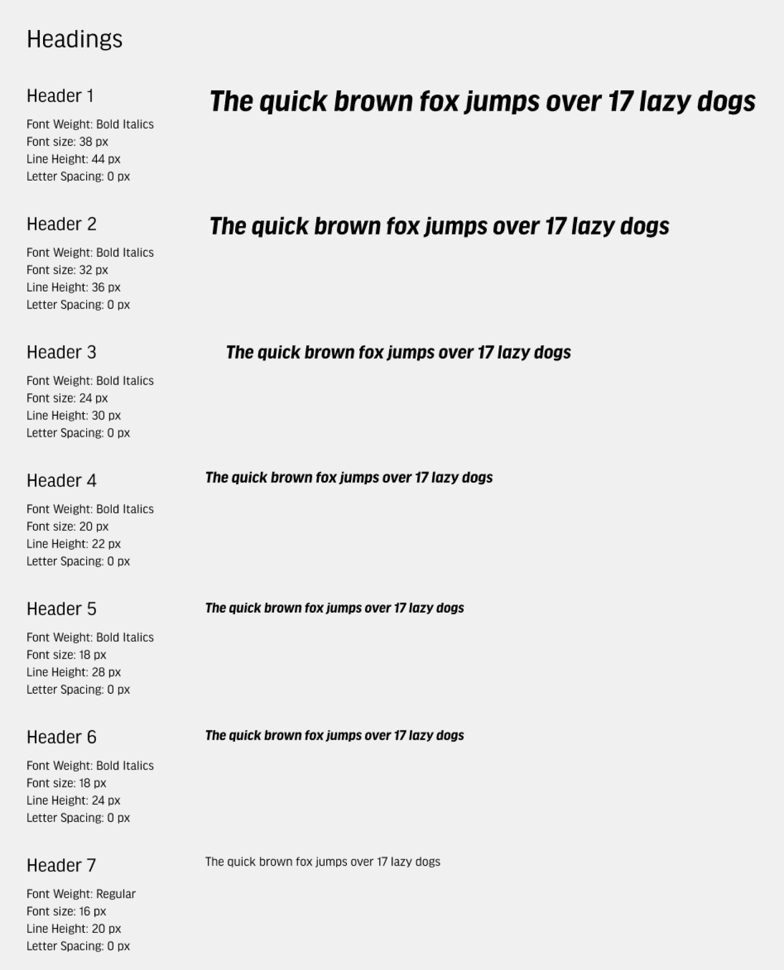
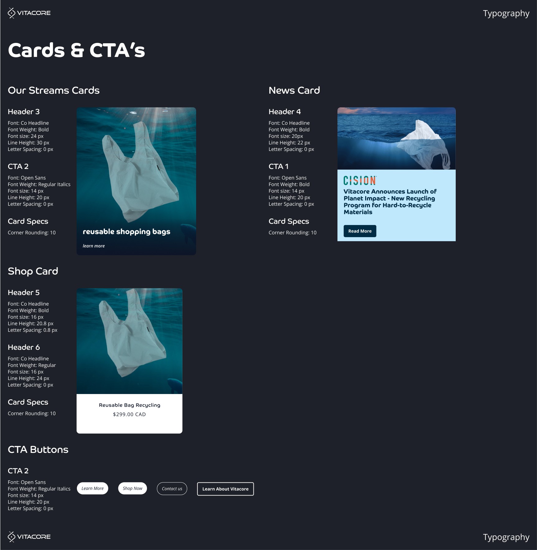
To begin, I went sifting through all the designs and taking cues from the Atomic Design approach. I organized everything into atoms first, starting up with typography, colours and spacing. As you can see below this was the typography system for our Vitacore company. I broke down to the very nitty-gritty details such as font weight, size, line height and spacing. I then provided an example text to the right to show to other users what it would look like.


Colour
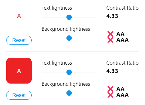
Choosing the right colour isn’t just about picking what looks pretty and what goes well on your design, it's about how accessible it is. While our text colours, black and grey passed with flying colours. Our brand blue and red did not fare too well with contrast ratio. Even though the contrast ratio was not where we wanted it to be, it doesn’t mean we should get rid of them and move on to a new colour. It gives us UX designers a challenge on when to utilize them, for example, CTA’s and links.


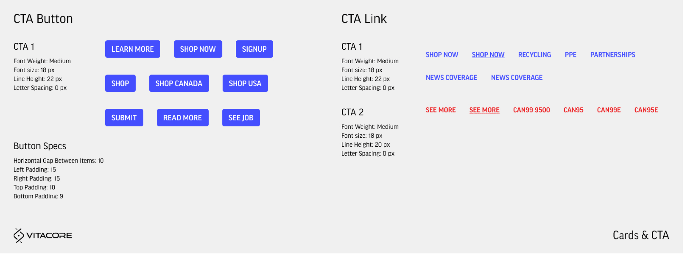
Cards and CTAs
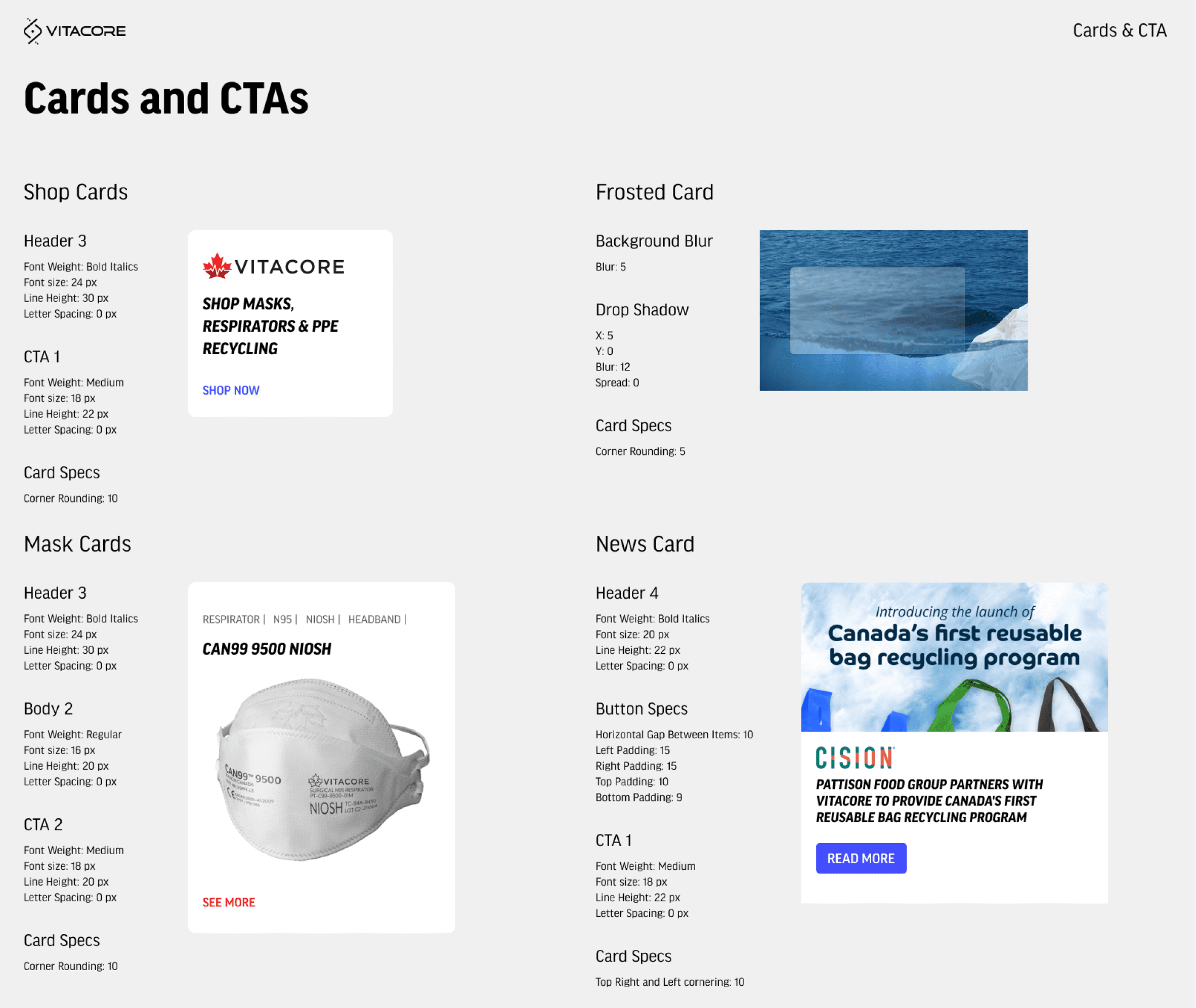
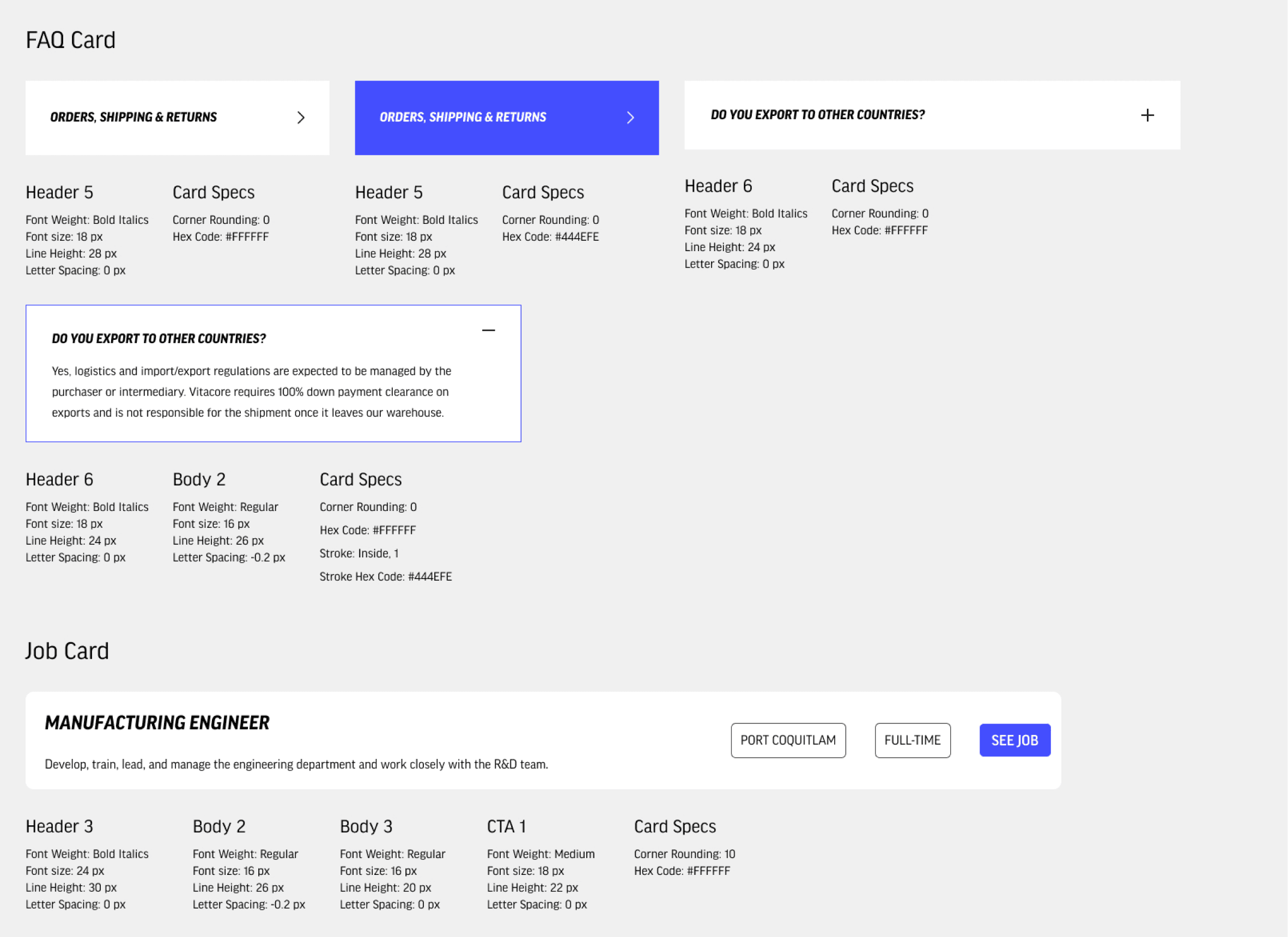
The next step in our design systems is combining atoms into molecules to form our cards and buttons. High-quality documentation of our components is crucial to an effective system, allowing others to quickly craft designs and speed up our workflow. However, something I noticed was a lot of our components lacked responsiveness. For example, for our buttons, if we needed to change the next, we would need to manually adjust the size to fit it correctly. This had the downside of slowing designers but also adding inconsistency. To fix that, I recreated the buttons and added an auto layout in our Figma files.
Planet !mpact - Ecosystems
With the Vitacore - Labs design system complete, it was time to work on Planet !mpact’s own framework. As it was still a growing company, its UI components weren’t as extensive as Vitacore’s, it was a straightforward categorization. It also helped to have rules already set in place with Vitacore’s design system, what I had to do was replicate it again for Planet !mpact.


Further Designs
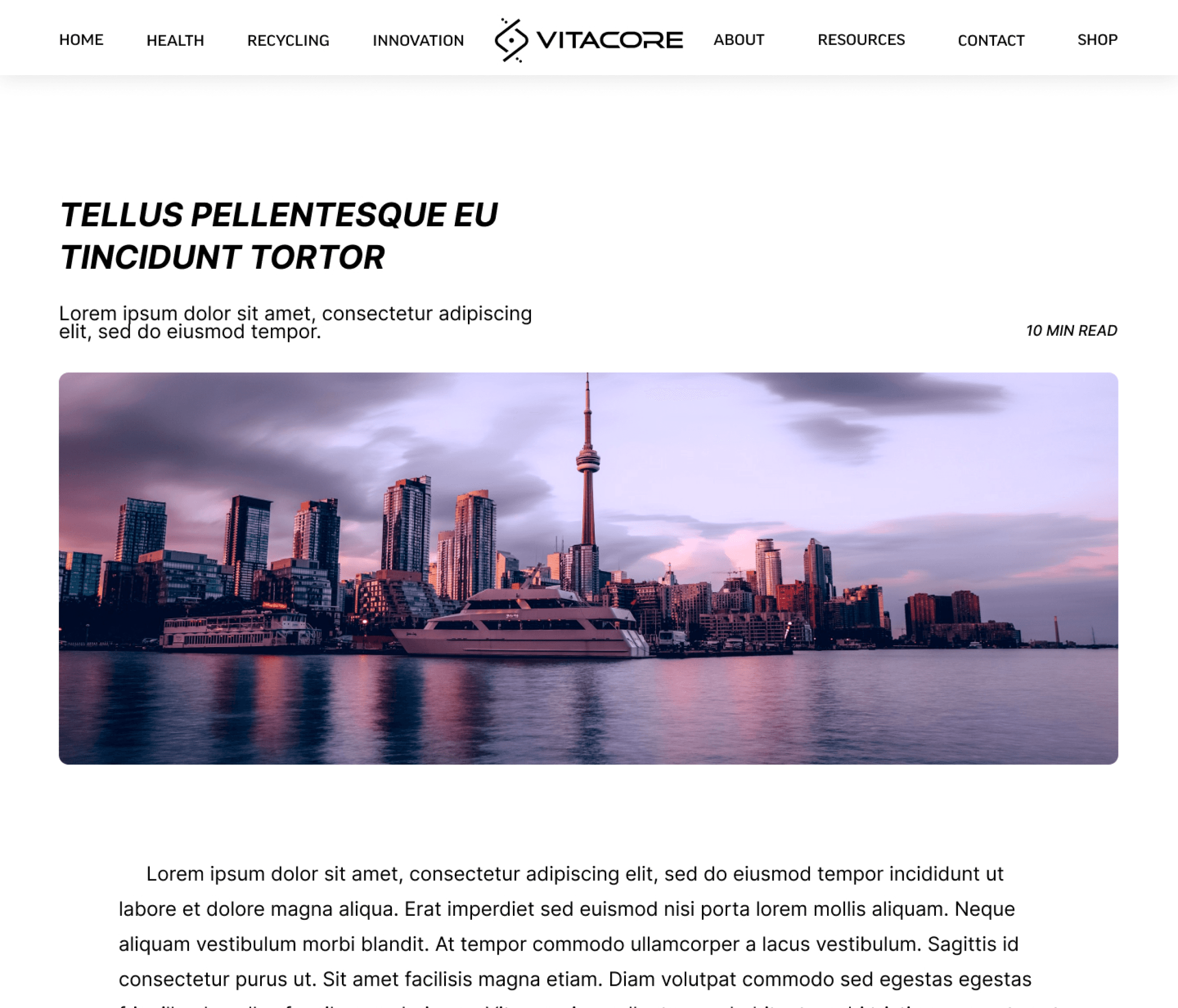
After completing and gaining approval for the design systems from my marketing manager, I utilized the system to create designs for the website revamp. One of the tasks was crafting a blog template for both our Vitacore and Planet !mpact websites. In this process, I wanted to differentiate the two brands by experimenting with UI elements. I implemented a dark mode for the Planet !mpact website to create a distinctive visual identity.

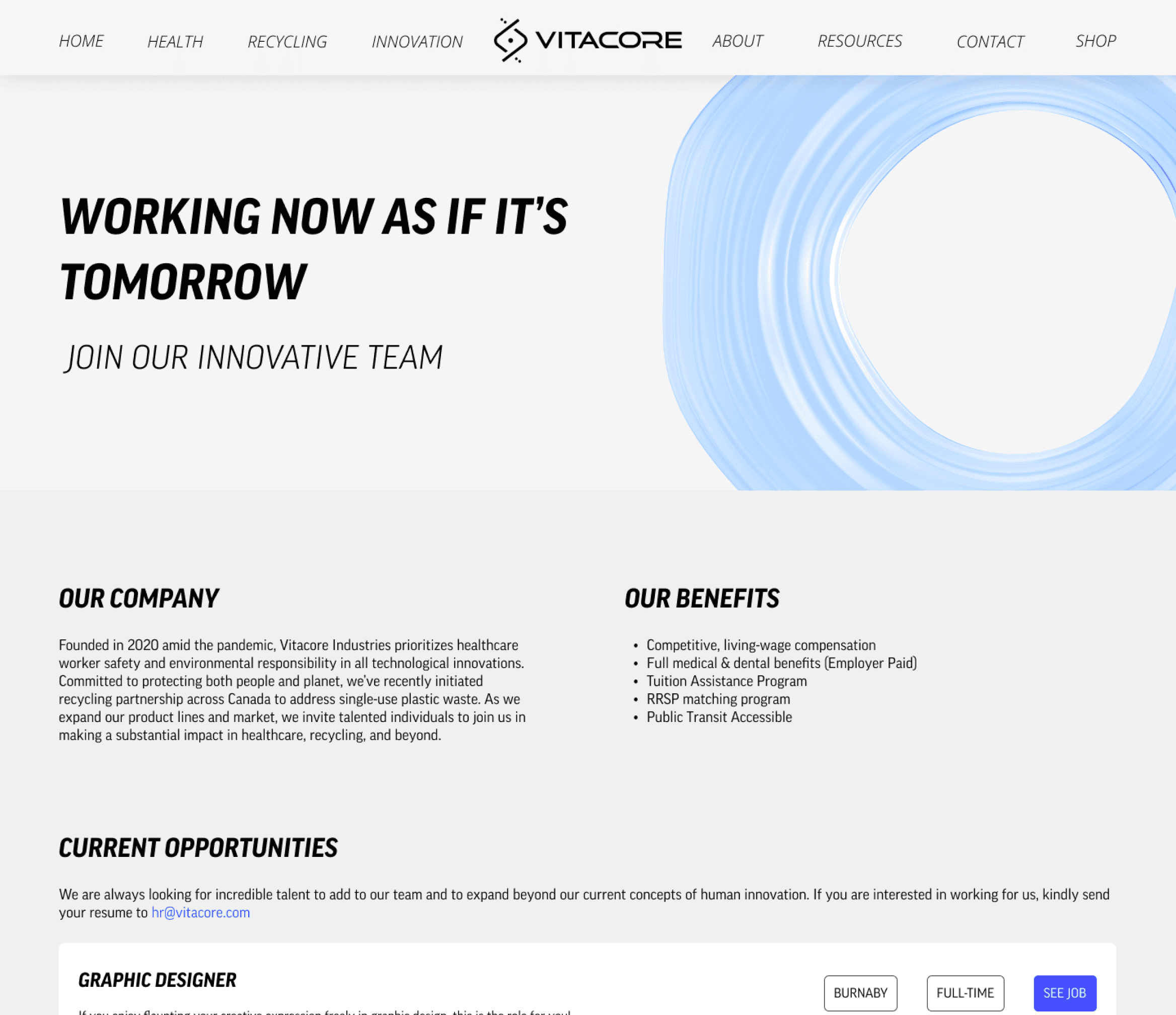
The next project involved designing both an 'About Us' and 'Careers' page. Given our company's rapid growth, attracting best was a priority. An 'About Us' page was crucial for showcasing our values and culture to prospective employees. While the 'Careers' page served as a way for highlighting the many diverse openings.

The Future
The process of creating a standardized design system that would be used across our department has been a huge learning lesson for our company. A design system is ever-changing as our company grows and we build more projects there will be more opportunities to add to our Vitacore Labs and Planet !mpact design systems. So far, what we have has improved our ability to meet deadlines and improve efficiency. The next steps for our team will include growing our component library as we move to the next big project; a customer portal to process our own payments and set the best practices to make sure our library stays up to date.
Next Project
Buildn -
Work Experience
Lead the design of the web platform that connects homeowners and professionals to complete dream renovation projects.
Click Here
